Biocomercio
Brand identity and e-commerce design for an organic nut producer in Alicante — from the logo to a fully navigable prototype of the storefront.
A brand that tastes of the field
The visual system comes straight from the product: the yellows and creams of the almond groves, a leaf green for the organic side, and a terracotta that adds warmth without falling back on the usual 'bio' green. Corben, with its rounded serifs, carries the brand voice in the headlines; Manrope holds the long copy without adding noise.
Brand palette
Section secondaries
Typography
Sabor en tu estilo de vida
ABCDEFGHIJKLMNÑOPQRSTUVWXYZ 0123456789
Frutos secos ecológicos cultivados y envasados en Alicante.
ABCDEFGHIJKLMNÑOPQRSTUVWXYZ 0123456789
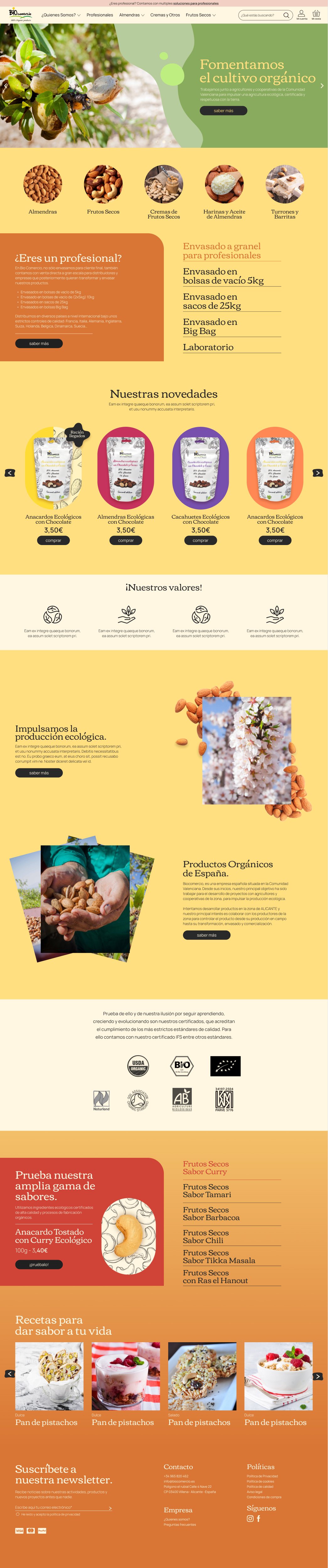
From identity to a storefront you can walk through
On that foundation, the full e-commerce designed in Figma: home, listing, product page, recipes and the corporate pages. Navigation is a component with its own states, so the dropdowns actually open and every link goes to its real screen. Below you can scroll through the full pages, exactly as they were designed.